Basic optimization techniques
it’s time to learn the essentials of landing page optimization.
In this post, you will:
- Take a quiz to determine your landing page optimization grade.
- Review the anatomy of a landing page
(Only 77% of marketors are testing their headline)
Landing page optimization Quiz
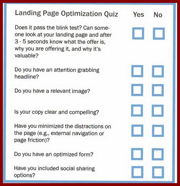 |
Landing page optimization Quiz |
section, we’ll dive into the specifics of an exceptional landing page.
The Anatomy Of A Landing Page
There are several key components that make a landing page effectivefor converting more visitors into leads. Let’s explore some of the key
techniques for building a successful landing page.
Below you’ll see the landing page we’re going to dissect. The numbers on
the page correspond with the descriptions for each landing page element
throughout the rest of this chapter

1. Headline
As the first landing page element your visitors will likely see first when they ‘land’ on your page, having a clear and concise headline is critical.
Use your headline to sum up your offer as clearly as possible. If it’s an ebook,say it’s an ebook. If it’s a coupon, say it’s a coupon. What kind of ebook or coupon is it? What will visitors who convert on your page receive? Why is this coupon beneficial? Answer these core questions so visitors quickly
understand the basics of what this page is for.
2. Hidden Navigation
In order to reduce friction on your landing page’s bounce rate, and increase the chances that your visitors will stay on your page, hide any top and side navigation bars from that page.
You don’t want unnecessary navigation buttons catching your readers’ eye and distracting them from
completing your form.
This visitor landed on your page for a reason -- to receive the offer you promoted. Don’t try to send them to another page on your site, simply provide them with a seamless way to retrieve the
information you promoted to bring them to your page.
3.Context
Below your main headline, consider using a subheader to provide a little bit of information about the benefits of your offer. This is also called your landing page’s value propostion.
Every piece of your page is a possible conversion point. If your visitor only read the subhead, would it be enough to entice them to complete the form? You want to add some context to your offer. Why is this offer valuable to your visitor? In our numbered example above, visitors discover that there’s more to social media than simply monitoring, and that you can nurture leads with social media lead intelligence. This should help them realize that the ebook promoted on the page will teach them smarter social media.
4.Value
In many cases, your subheader and context won’t be quite enough to motivate your visitor he or she should make a purchase or download your offer. Use the rest of the text on your landing page to clearly and simply explain the value of your offer.
Use bullet points to demonstrate concrete takeaways, break up large blocks of text, and keep your copy brief and to-the-point.
Specifically, what will a person take away from your offer? Will they learn how to do something? Become more knowledgeable about a specific topic? Build a better mousetrap?
In our example, visitors will receive a “41-page guide.” No question about it!
5.Image
90% of information transmitted to the brain is visual, and visuals are processed 60,000X faster in the brain than text. If there’s anything these stats teach us, it’s that it’s always wise to include a relevant image on your landing page.
Try to match then that image with the offer. For example, if you’re offering an ebook or a webinar, show a cover of the ebook or a screenshot of the webinar’s presentation cover slide. This will give your
landing page visitors a tangible idea of what they’ll receive.
6.Lead-Capture Form
Your lead-capture form is the place your page visitors will supply information in exchange for your offer. It’s also what converts those visitors into precious sales leads.
As a best practice, only ask for information you need from your leads in order to effectively follow up with and/or qualify them.
Generally, longer forms will result in fewer but more qualified leads, and shorter forms will result in more but less qualified leads.
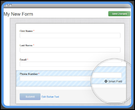
An easy solution to this is Smart Forms
Smart Forms autofill fields that a returning visitor has already entered. This means that a returning visitor will see a shorter form with less friction the second time they return to a page, since the software has already saved their previous submission information.
Use Smart Fields to shorten Form
Your landing pages are seen by a multitude of different people with different needs and interests.
HubSpot’s Smart Content enables components of your landing page to shift based on the past
experiences of the person looking at it.
 |
| Smart Forms |
Smart Fields: Automatically remove any form fields for which you already have information on a lead.
Smart CTA s: Change your offer or call-to-action based on where a lead is in his or her decision process
Smart Images: Shift an image on your page to reflect what you know about a lead’s industry or other profile details.
7.Privacy Policy Link
Include a link to your business’ privacy policy on your landing page or directly within your lead-capture form to give your visitors peace of mind.
Visitors are protective of their personal information, and rightly so. Too many people are spammed with emails and phone calls when they haven’t opted into such. But, don’t just provide visitors with your company’s privacy policy to quell their anxiety.
Be sure that you actually are a trustworhy source, and don’t sell customer information to other vendors.
This should positively impact the performance of your landing page and build a reputation for credibility among your loyal customers.
8. Submit Button
At the bottom of your lead-capture form should be a submission button.
This button is the actual call-to-action button on your landing page. Be sure this button employs specific action words so your visitors clearly understand what they have to do to obtain the offer you’re presenting.
Avoid using a general word like ‘submit.’ Eliminate any vagueness, and instead indicate exactly what action your visitors must take. If they’re going to receive an ebook, use a word like ‘download.’ If visitors are signing up for a 25% off coupon, use a phrase like ‘access coupon.’
If they’re receiving a free product trial, try using the phrase ‘sign up.’
9. Social Sharing Button/Link
 Enable visitors to easily share your landing pages with their connections by including social media sharing links or buttons. Include buttons for social networks like Facebook, LinkedIn, Twitter, and the like.
Don’t forget to include a share button for email, too. It may not be “social,” but email forwarding and sharing helps spread your content across more audiences.
Don’t miss out on this simple opportunity to extend the reach of your landing page and the content it offers beyond your direct network and reach. More visibility will lead to more landing page traffic and, ultimately, more leads!
Kindly Share This Post »»
|
|
|
Tweet |